

Switch
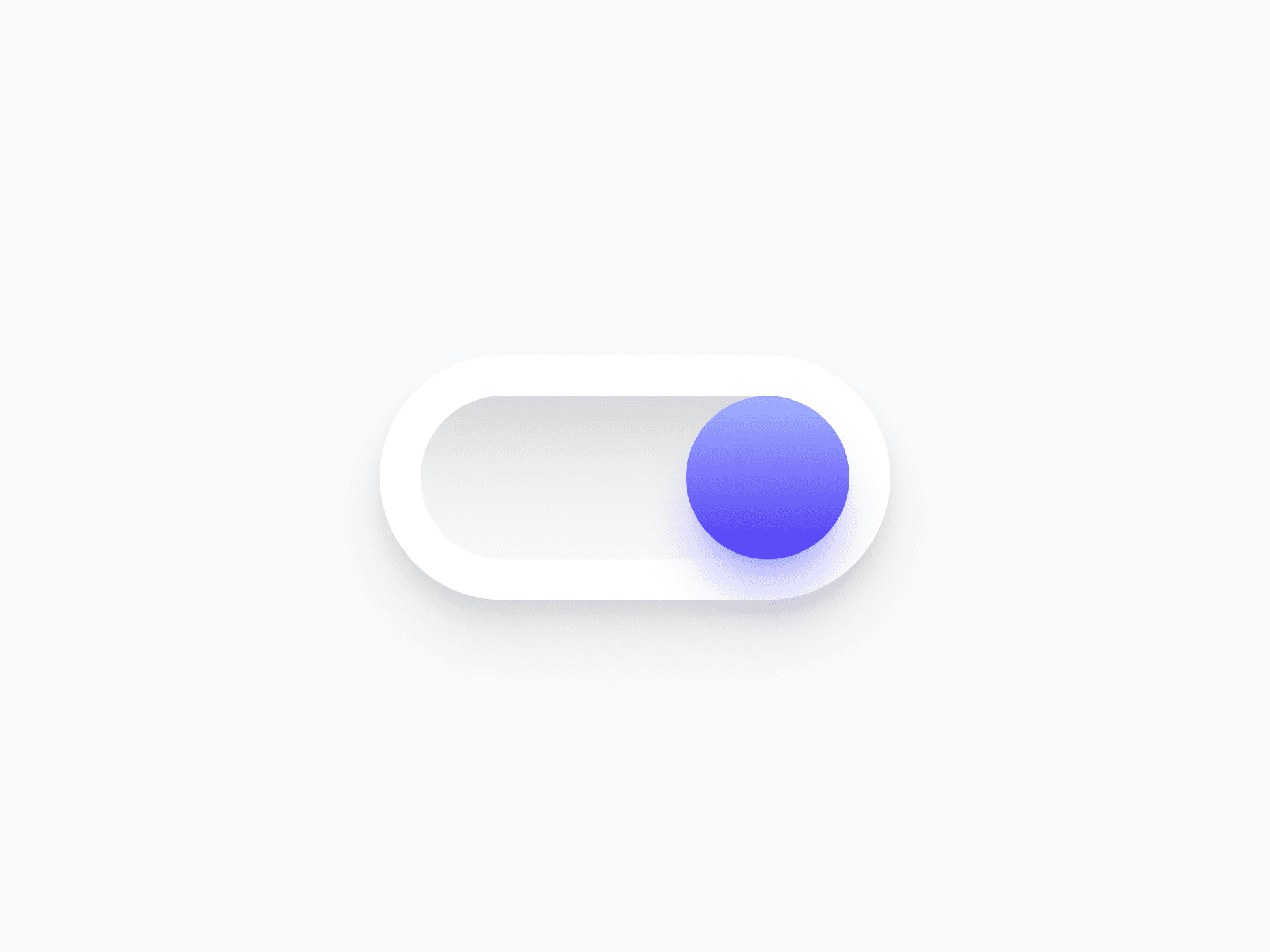
A binary toggle control for enabling and disabling settings, features, and preferences. Switch covers 5 variants, 2 handle types, and optional icon indicators, ready in Figma and React.







Loved by 2,000+ users worldwide.
Overview
Switch is a binary toggle control for enabling and disabling settings, features, and preferences. With 5 semantic variants, 2 handle types, and optional icon and on/off indicators, it adapts to every surface and toggle context, from compact system settings to rich preference panels.
Figma Preview
When should you use them?
Use a switch for an immediate on/off setting that takes effect right away, like enabling notifications, toggling dark mode, or turning a feature on. Use a checkbox instead when the choice is part of a form that's submitted later.
How should you use them?
- Use a switch for instant on/off settings; use a checkbox when the choice is submitted with a form.
- Make the switch apply its change immediately, with no separate save step.
- Add icon or on/off indicators when color alone isn't enough to show state.
- Label the switch by what it controls, not its state ('Email notifications', not 'On').
- Use the Semantic variant when green and red help communicate the meaning of each state.
- Keep the switch keyboard-toggleable with the Space key and labeled for screen readers.
Questions,
answered clearly.
Plans, pricing, licensing, updates, and technical questions, all answered in one place.
Still have questions?


Your current plan is a one-time payment, no subscriptions, no recurring charges for what you buy today. Some future Create UI products (such as AI-powered features) may be offered as optional add-on subscriptions, but these are entirely separate and will never affect your existing purchase. What you buy now, you own permanently.

Stop deciding. Start shipping.
Install it today and your next screen takes an hour instead of a day. Keep rebuilding from scratch, and next quarter looks exactly like this one.
Start Free Now. Upgrade whenever you need.



