

Segmented Control
A compact selection component for switching between a fixed set of views, modes, or filters. Segmented Control offers 2 variants, 5 sizes, and 2 to 5 segments, ready in Figma and React.







Loved by 2,000+ users worldwide.
Overview
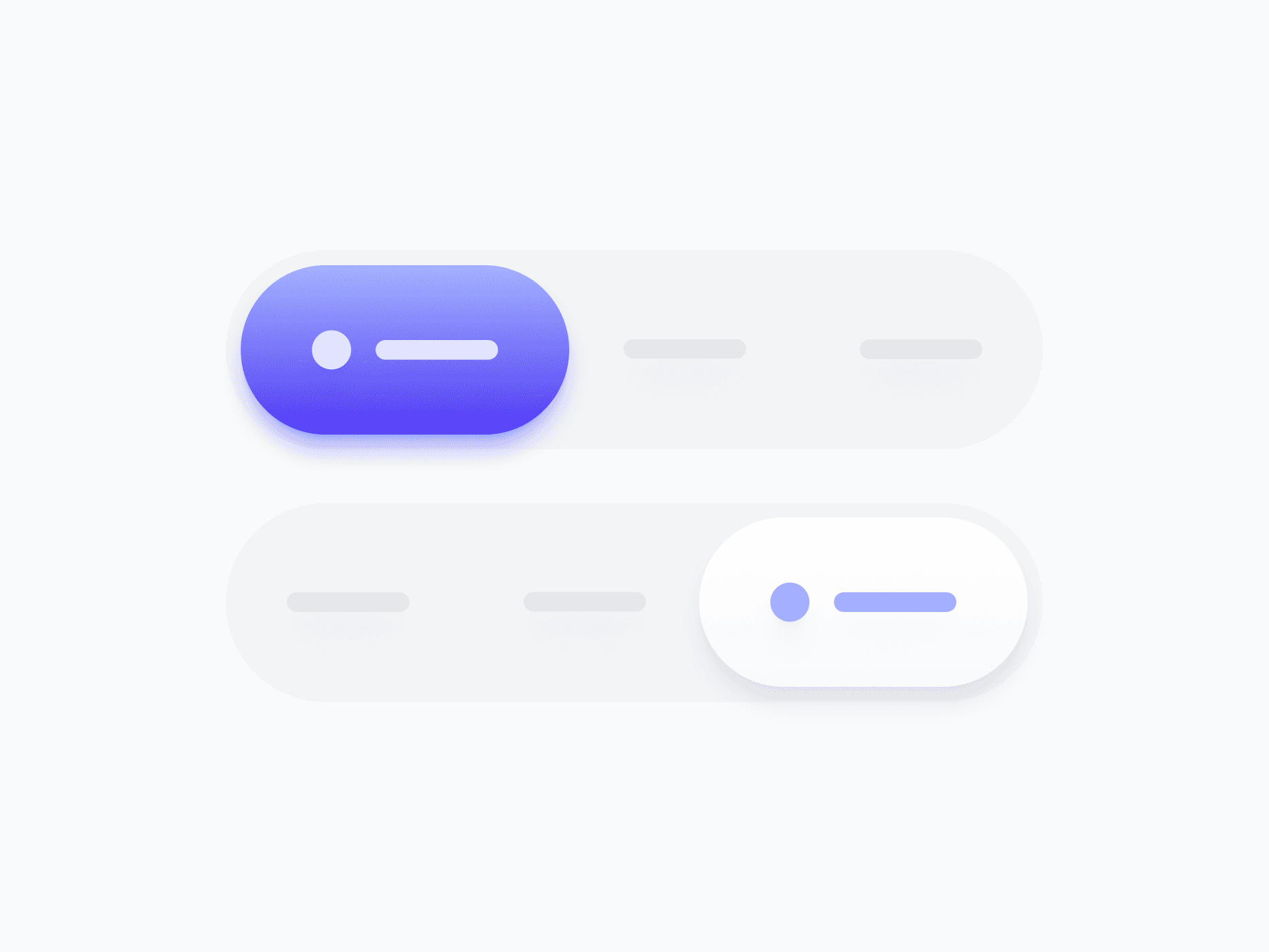
Segmented Control is a compact selection component for switching between a fixed set of views, modes, or filters. With 2 variants, 5 sizes, and flexible segment counts from 2 to 5, it's the go-to choice for tab-like navigation, view toggles, and option switching within a single content area.
Figma Preview
When should you use them?
Use a segmented control to switch between a small, fixed set of mutually exclusive views or modes, like List vs Grid, or Day, Week, and Month. Keep it to 2 to 5 options where all choices fit comfortably and stay visible at once.
How should you use them?
- Use a segmented control for 2 to 5 mutually exclusive options that all stay visible.
- Use a select instead when there are too many options to show at once.
- Keep segment labels short and parallel so the control stays compact and scannable.
- Show the selected segment clearly so users always know the current view.
- Use Icon Only mode in tight toolbars where text labels aren't needed.
- Keep segments keyboard-navigable with arrow keys, like a native tab set.
Questions,
answered clearly.
Plans, pricing, licensing, updates, and technical questions, all answered in one place.
Still have questions?


Your current plan is a one-time payment, no subscriptions, no recurring charges for what you buy today. Some future Create UI products (such as AI-powered features) may be offered as optional add-on subscriptions, but these are entirely separate and will never affect your existing purchase. What you buy now, you own permanently.

Stop deciding. Start shipping.
Install it today and your next screen takes an hour instead of a day. Keep rebuilding from scratch, and next quarter looks exactly like this one.
Start Free Now. Upgrade whenever you need.



