

Chips
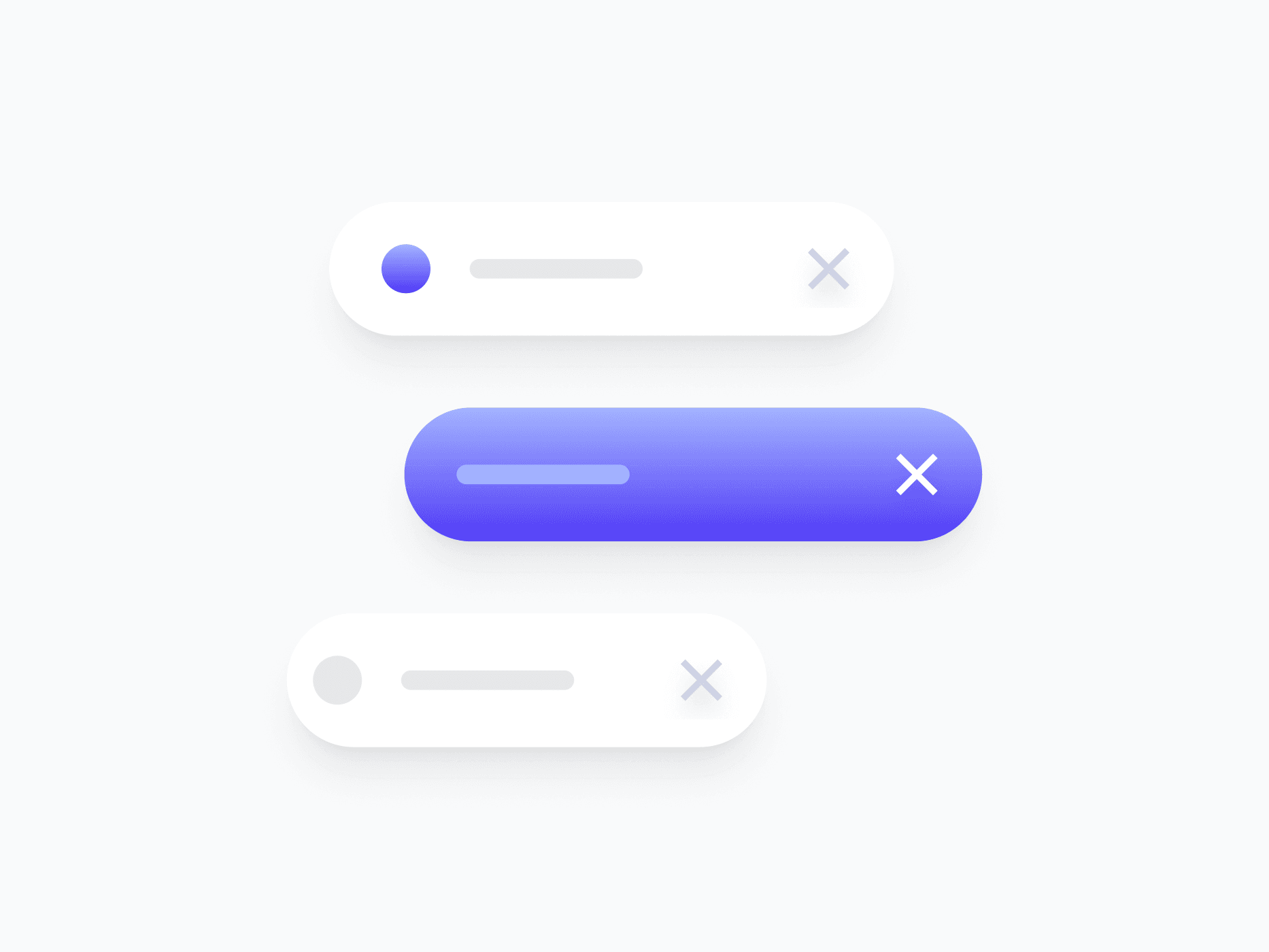
Compact, interactive tags for representing selections, filters, attributes, and categorized values. Chips offer 4 content variants, 5 sizes, and a full interaction state set, ready in Figma and React.







Loved by 2,000+ users worldwide.
Overview
Chips are compact, interactive tags for representing selections, filters, attributes, and categorized values. With 4 content variants, 2 appearance styles, 4 colors, and a complete interaction state set, they adapt to tag inputs, filter bars, multi-select fields, and inline labeling across any surface.
Figma Preview
When should you use them?
Use chips to represent discrete, compact values a user can scan or interact with, like applied filters, selected tags, categories, or recipients. Make them removable when users can clear a selection, or selectable when they act as toggleable filters.
How should you use them?
- Use chips for compact, discrete values like filters, tags, or selections.
- Use color to reinforce meaning (Success, Danger, Info), not as the only signal.
- Choose the variant that fits the content: Avatar for people, Country for regions, Brand for logos.
- Keep chip labels short, ideally one or two words, so they stay compact.
- Keep chips keyboard-accessible, so users can focus and remove them without a mouse.
Questions,
answered clearly.
Plans, pricing, licensing, updates, and technical questions, all answered in one place.
Still have questions?


Your current plan is a one-time payment, no subscriptions, no recurring charges for what you buy today. Some future Create UI products (such as AI-powered features) may be offered as optional add-on subscriptions, but these are entirely separate and will never affect your existing purchase. What you buy now, you own permanently.

Stop deciding. Start shipping.
Install it today and your next screen takes an hour instead of a day. Keep rebuilding from scratch, and next quarter looks exactly like this one.
Start Free Now. Upgrade whenever you need.



