

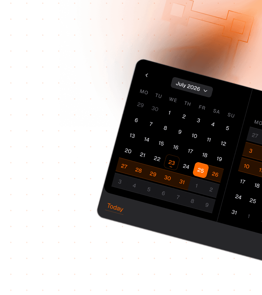
The UI component library for Figma and React. Production-ready.
Every component ships in both Figma and React, with full variant coverage for size, state, style, and interaction. No gaps between design and production.



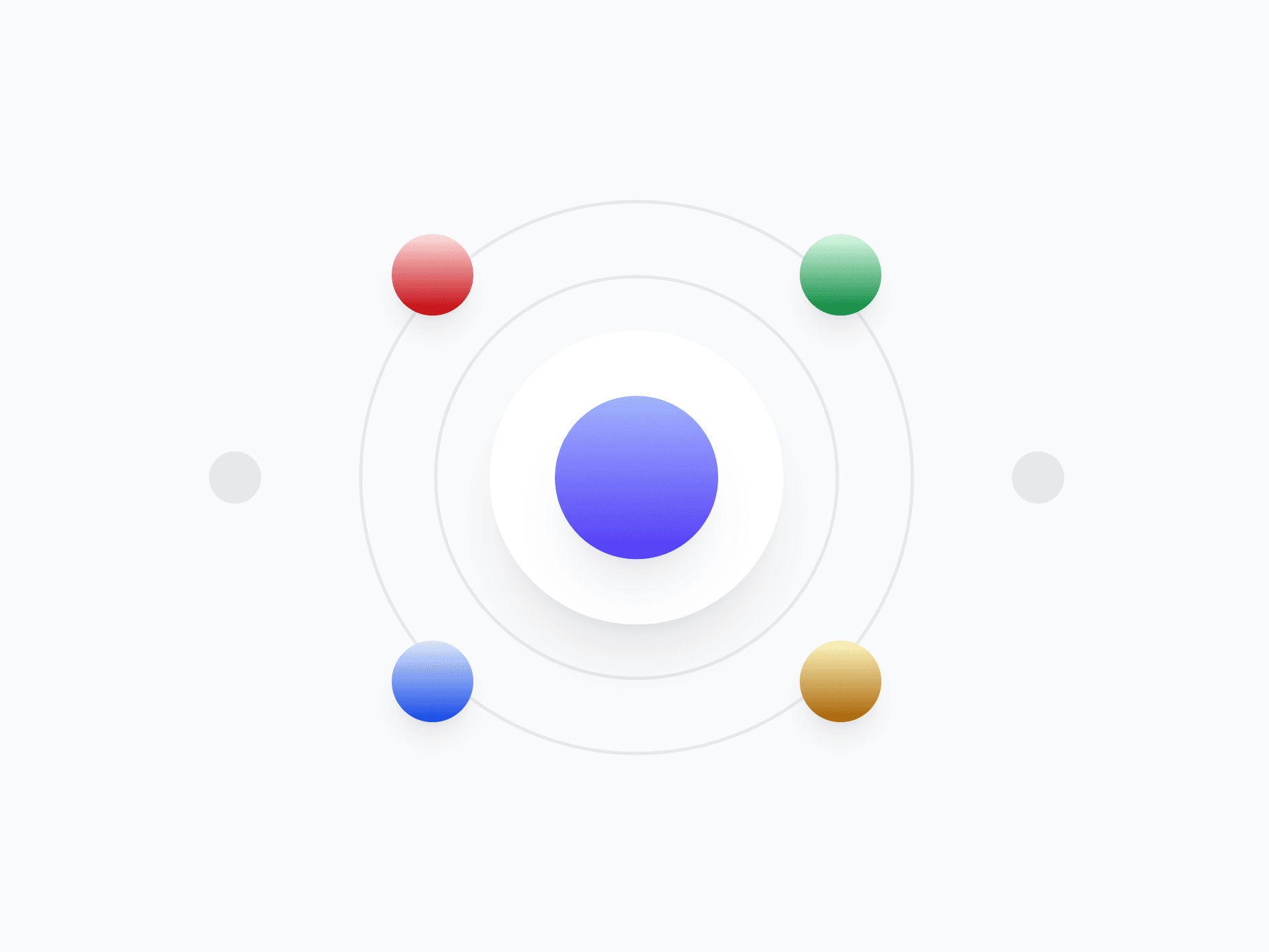
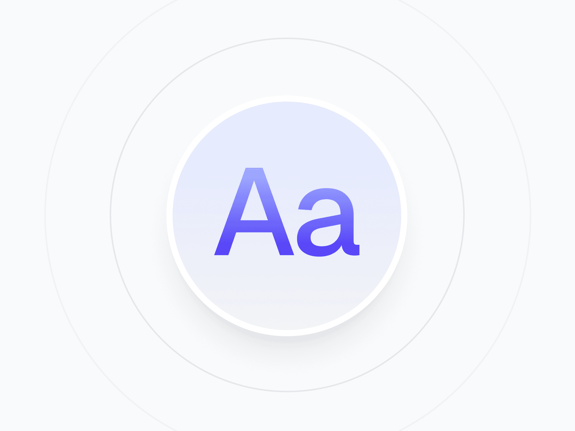
Foundations
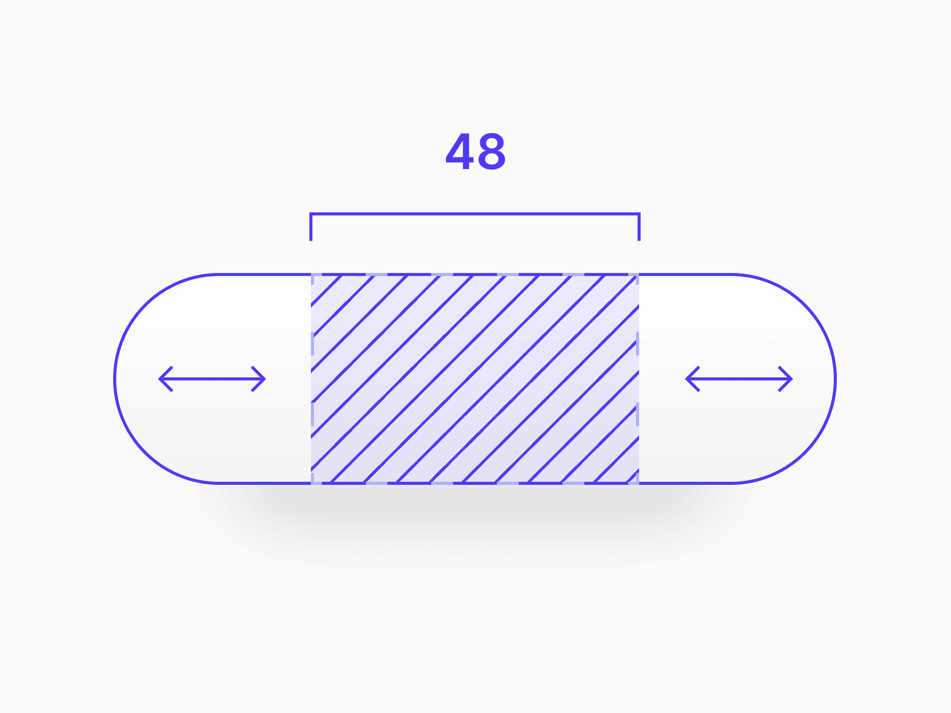
The visual foundation of Create UI. Color system, typography, spacing, radius, and shadow styles. Everything components are built on.

Components
Buttons, inputs, modals, navigation, and more. Every UI component available in Figma and React.
![Button [Default]](/_next/image?url=%2Fwebsite%2Fcomponents-button.png&w=3840&q=75)
Button & Actions
Button [Default]
![Button [App Store Badges]](/_next/image?url=%2Fwebsite%2Fcomponents-app-store-badge.png&w=3840&q=75)
Button & Actions
Button [App Store Badges]
![Button [Group]](/_next/image?url=%2Fwebsite%2Fcomponents-button-group.png&w=3840&q=75)
Button & Actions
Button [Group]
![Button [Close]](/_next/image?url=%2Fwebsite%2Fcomponents-close-button.png&w=3840&q=75)
Button & Actions
Button [Close]
![Button [Text Link]](/_next/image?url=%2Fwebsite%2Fcomponents-text-link.png&w=3840&q=75)
Button & Actions
Button [Text Link]
![Button [Social / SSO]](/_next/image?url=%2Fwebsite%2Fcomponents-button-social.png&w=3840&q=75)
Button & Actions
Button [Social / SSO]
![Button [Floating Action Button]](/_next/image?url=%2Fwebsite%2Fcomponents-fab-button.png&w=3840&q=75)
Button & Actions
Button [Floating Action Button]
![Input [Text]](/_next/image?url=%2Fwebsite%2Fcomponents-input.png&w=3840&q=75)
Form Controls
Input [Text]
![Input [OTP]](/_next/image?url=%2Fwebsite%2Fcomponents-otp-input.png&w=3840&q=75)
Form Controls
Input [OTP]
![Input [Text Area]](/_next/image?url=%2Fwebsite%2Fcomponents-textarea.png&w=3840&q=75)
Form Controls
Input [Text Area]
![Input [Stepper / Number]](/_next/image?url=%2Fwebsite%2Fcomponents-stepper-number-input.png&w=3840&q=75)
Form Controls
Input [Stepper / Number]
![Input [Tag]](/_next/image?url=%2Fwebsite%2Fcomponents-input-tag.png&w=3840&q=75)
Form Controls
Input [Tag]
Form Controls
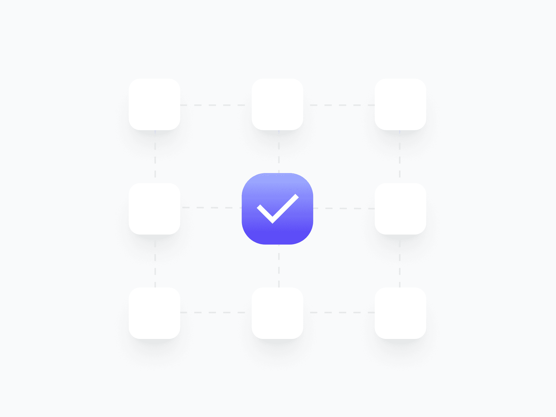
Checkbox
Form Controls
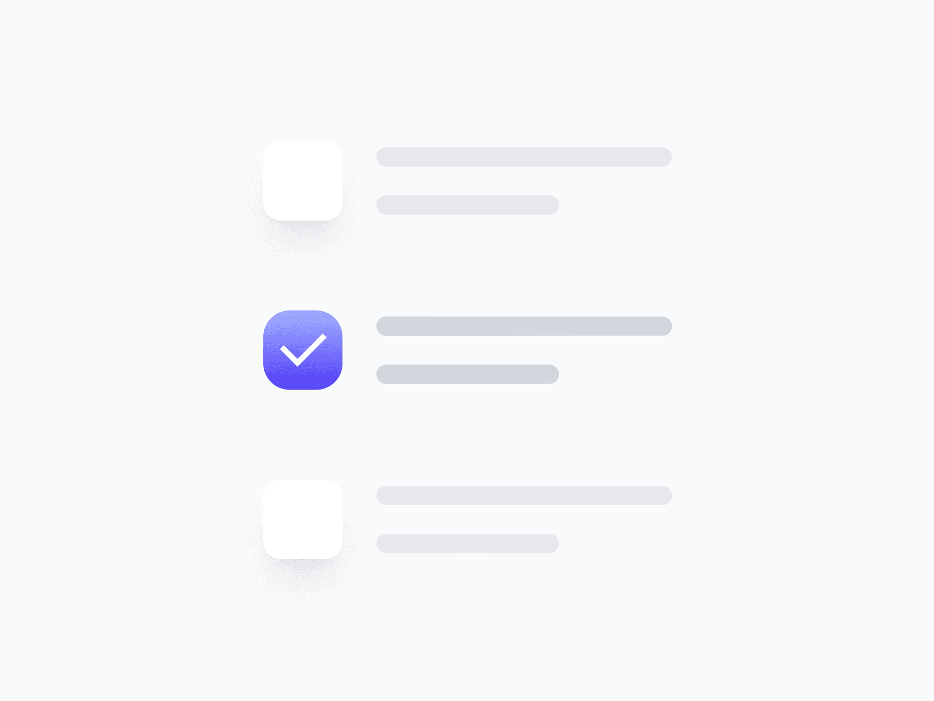
Checkbox Group

Form Controls
Radio
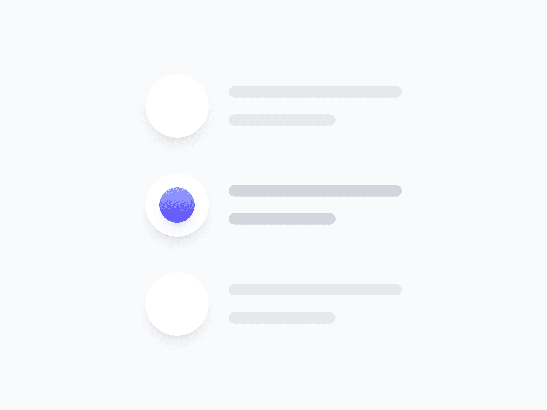
Form Controls
Radio Group
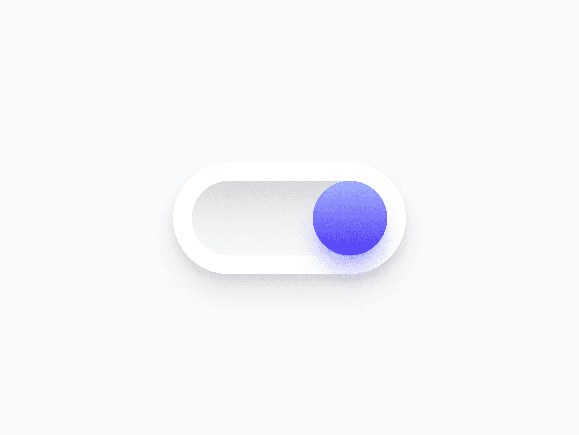
Form Controls
Switch
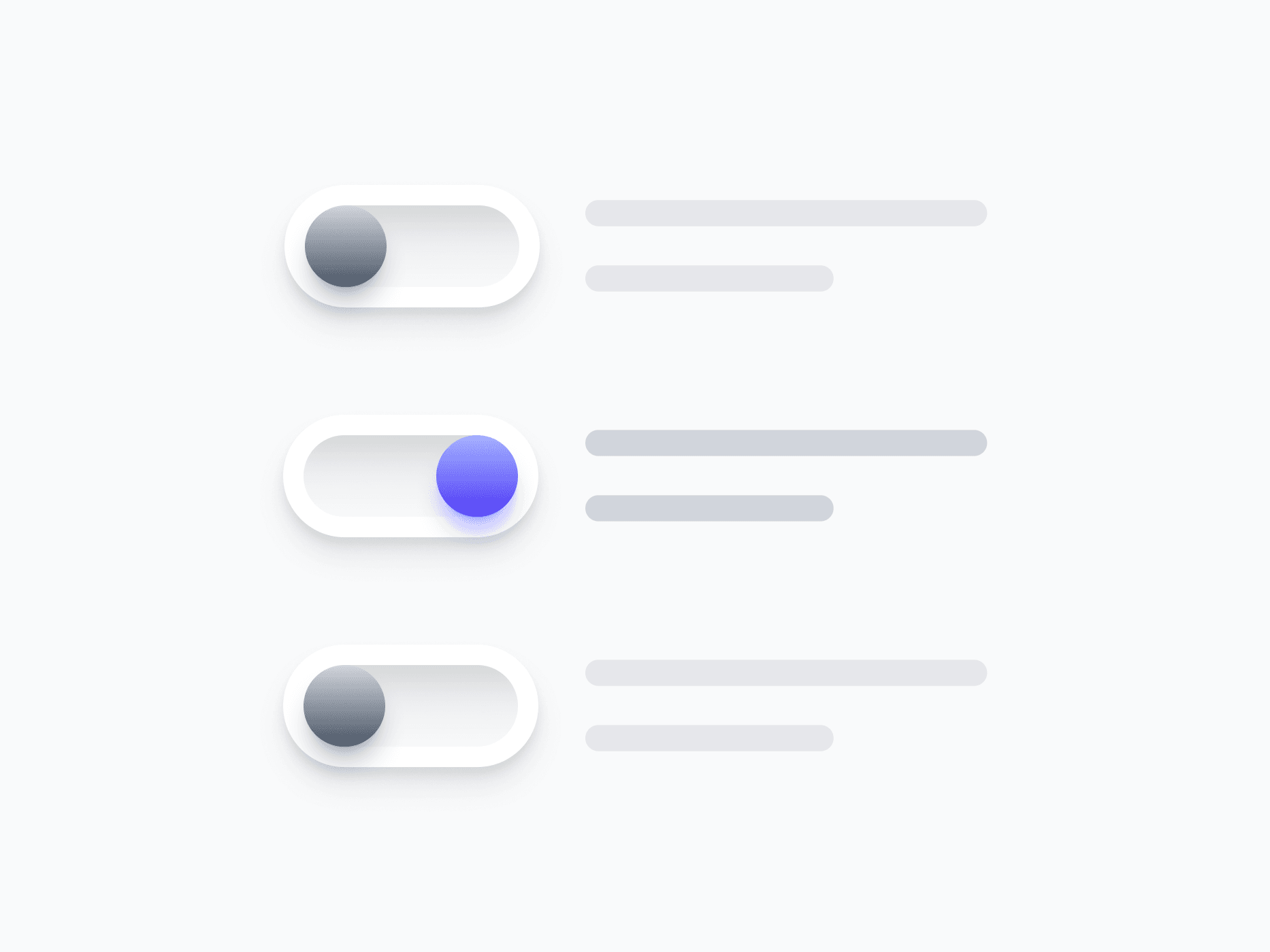
Form Controls
Switch Group
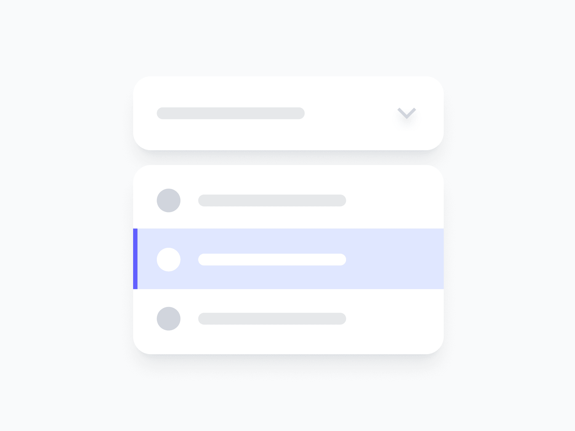
Form Controls
Select
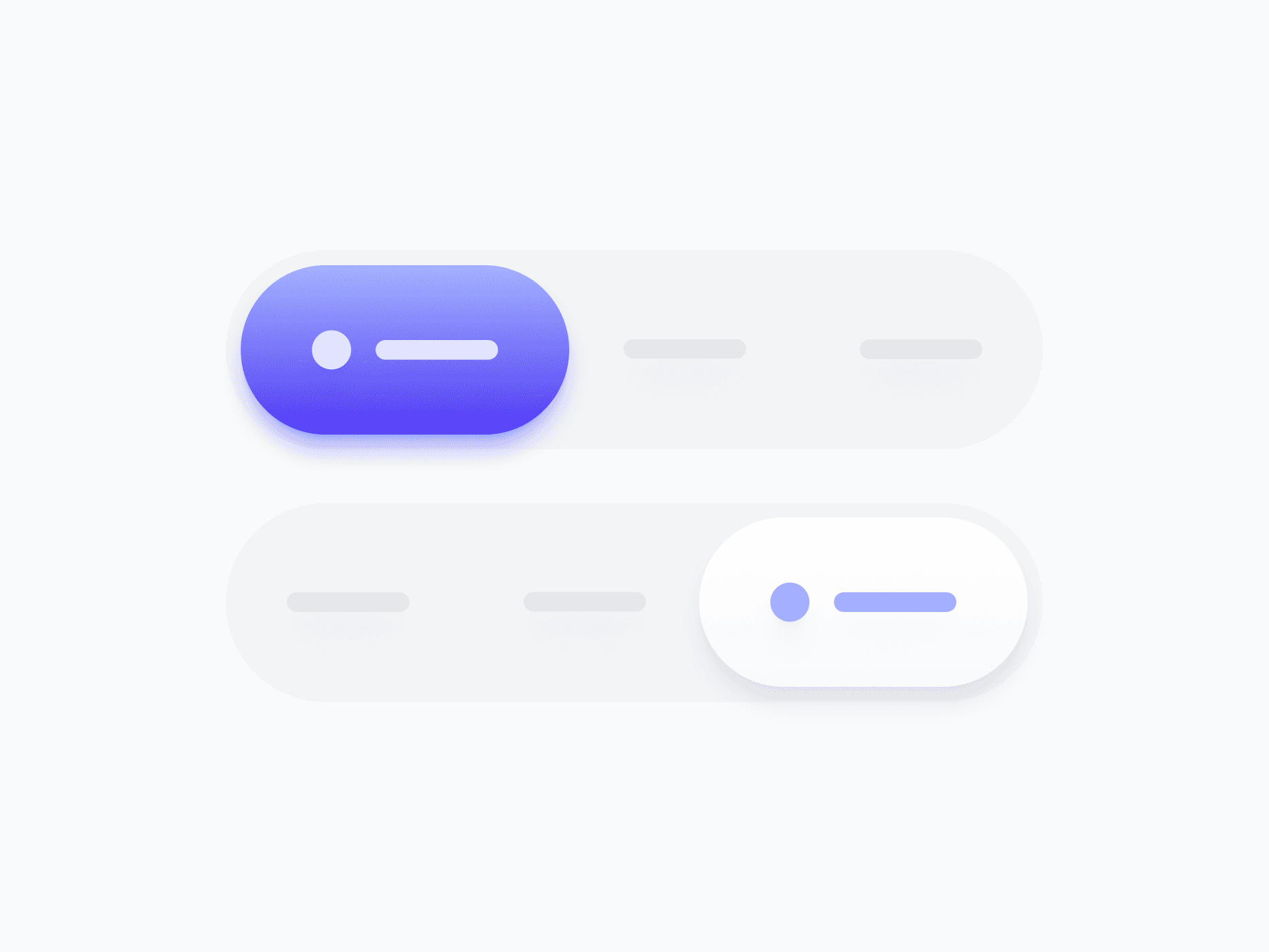
Form Controls
Segmented Control
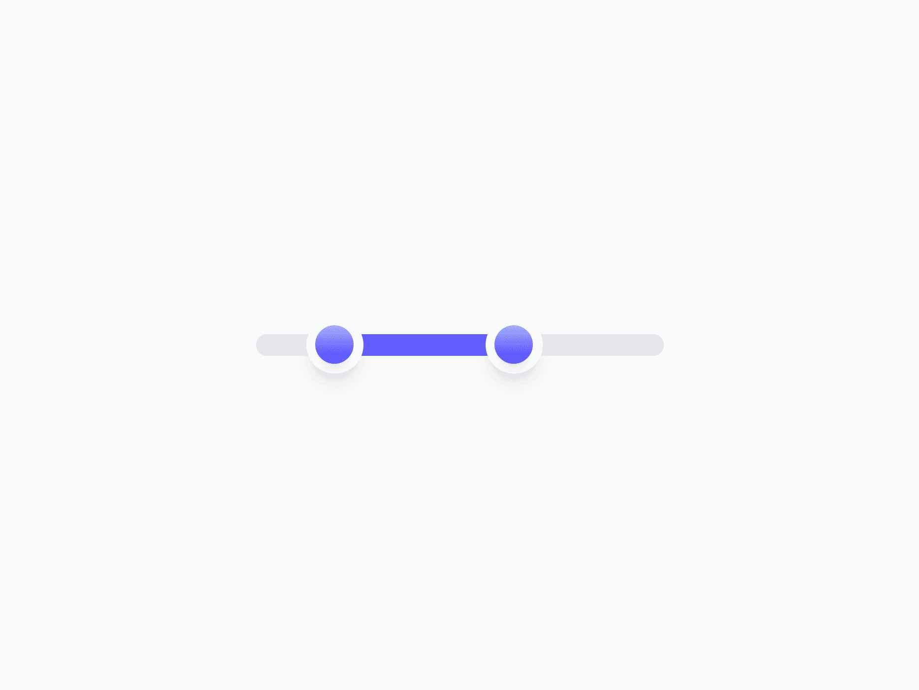
Form Controls
Slider
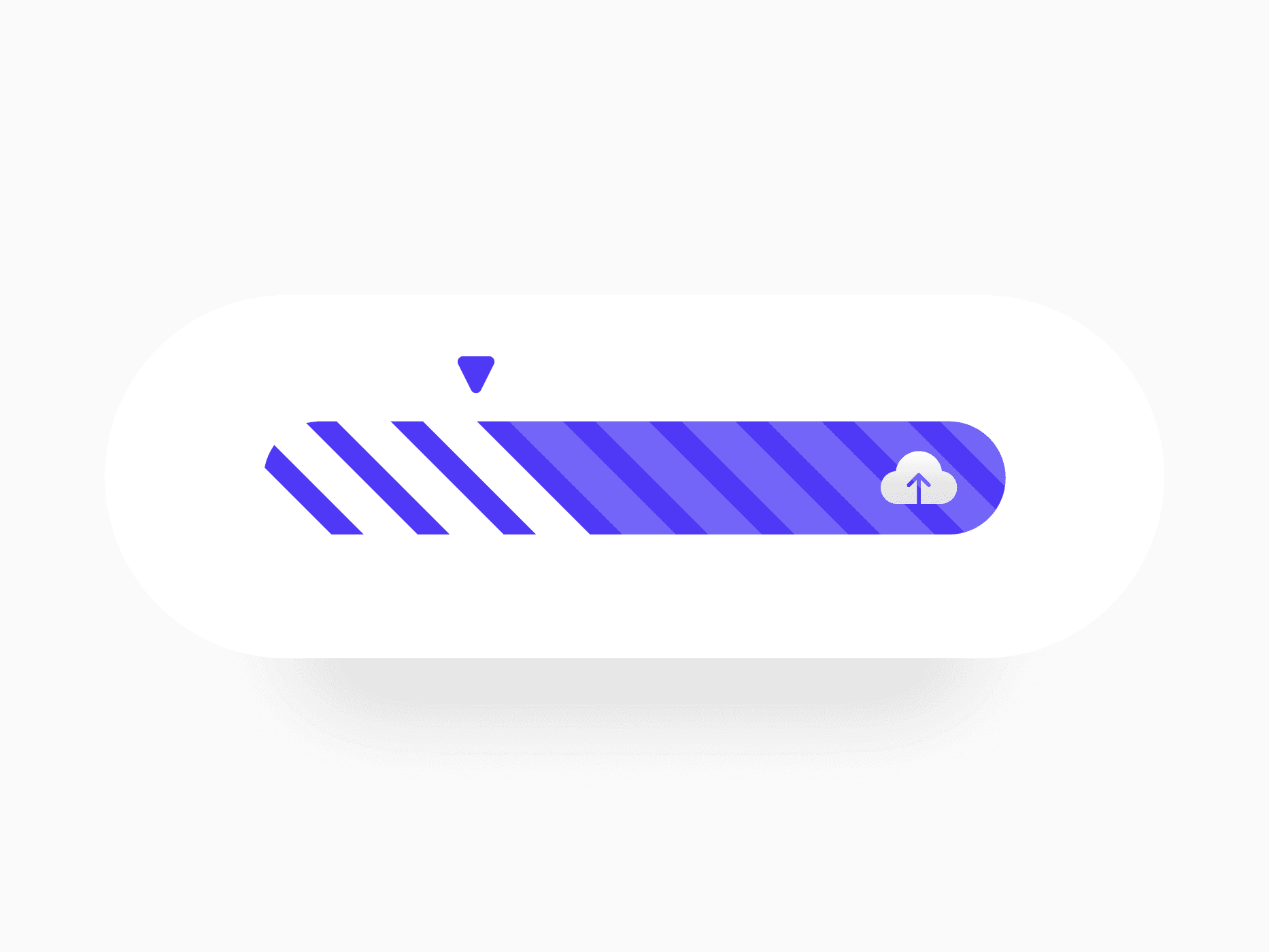
Form Controls
File Upload
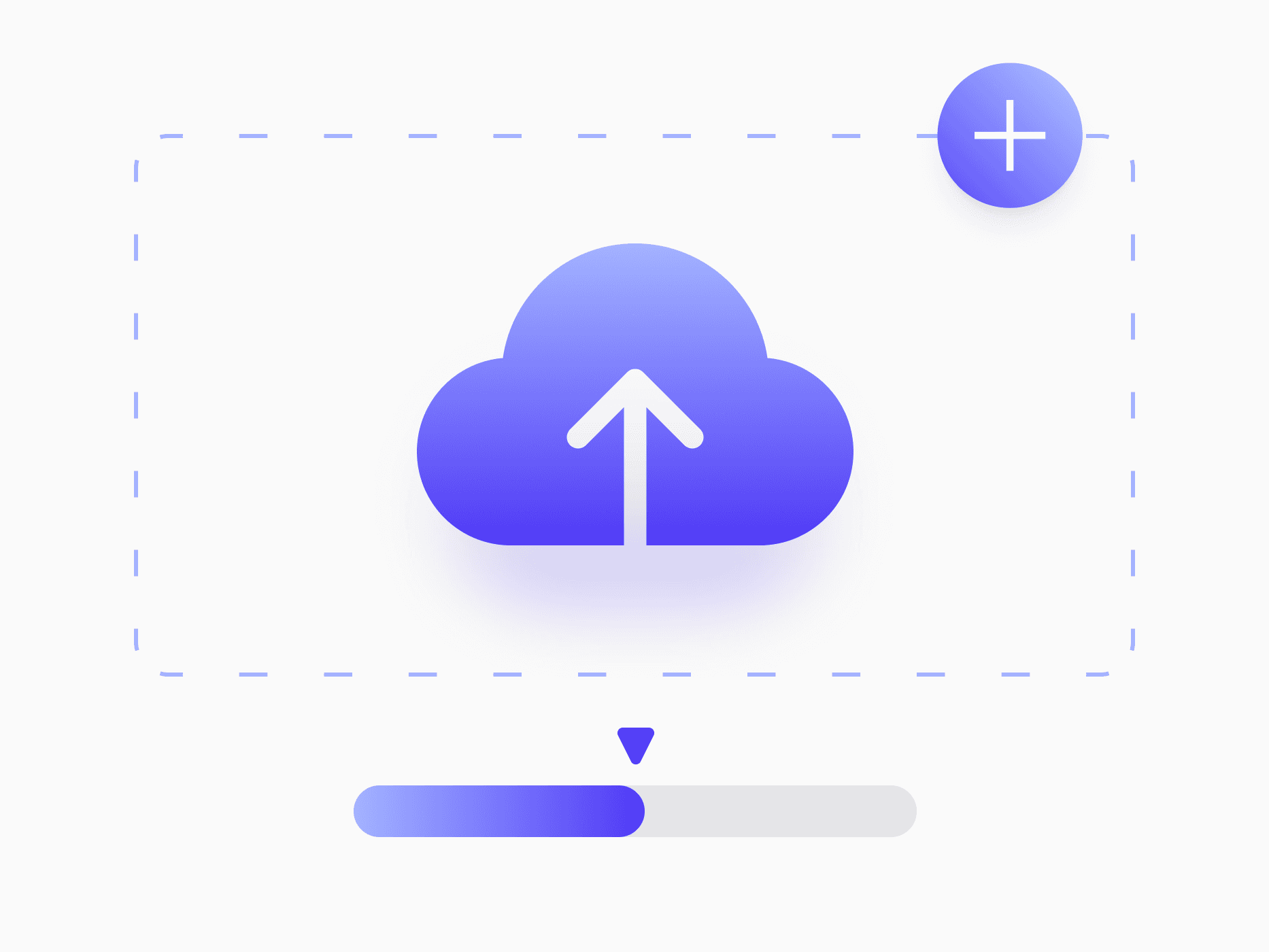
Form Controls
Dropzone
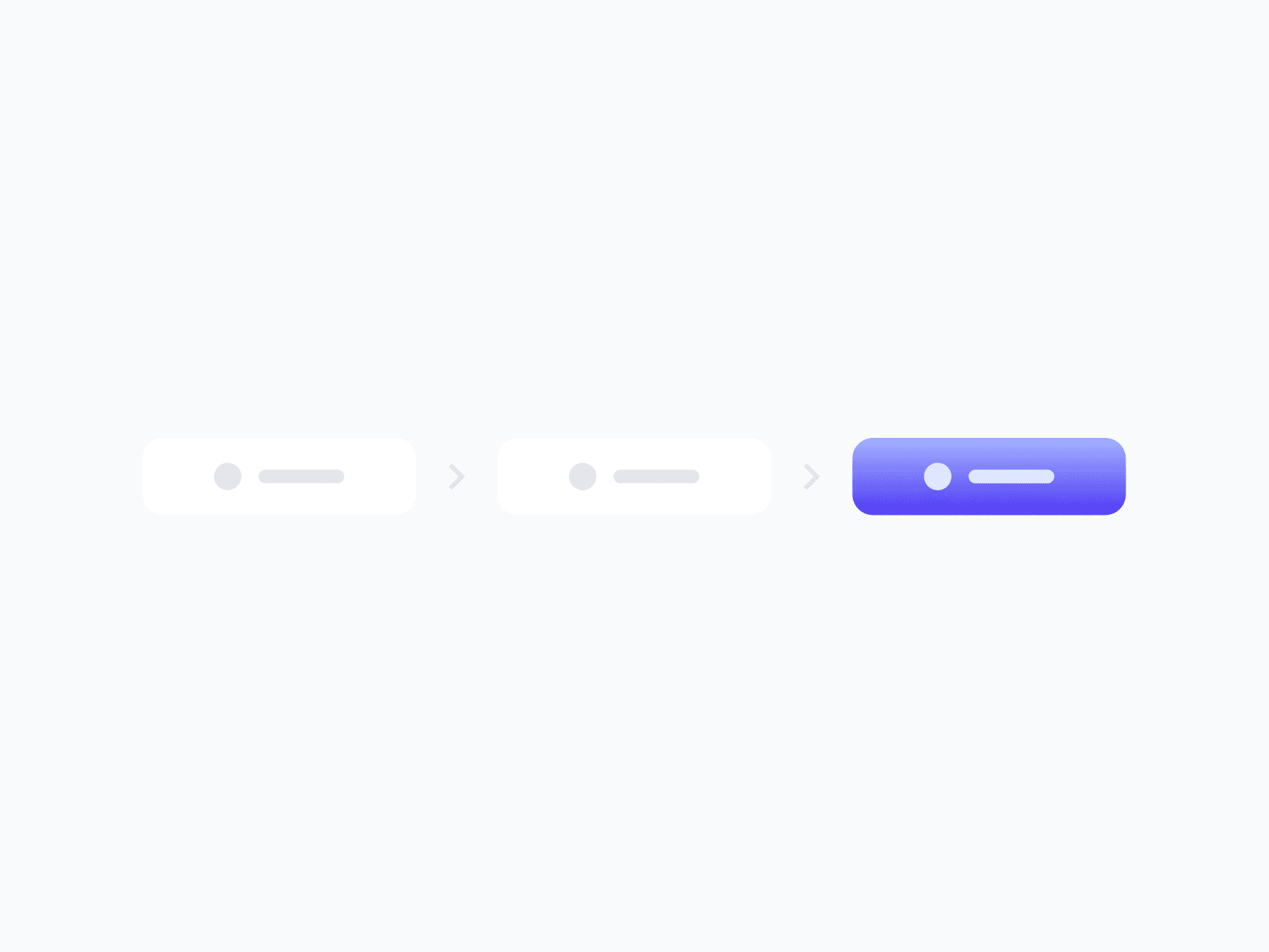
Navigation
Breadcrumbs
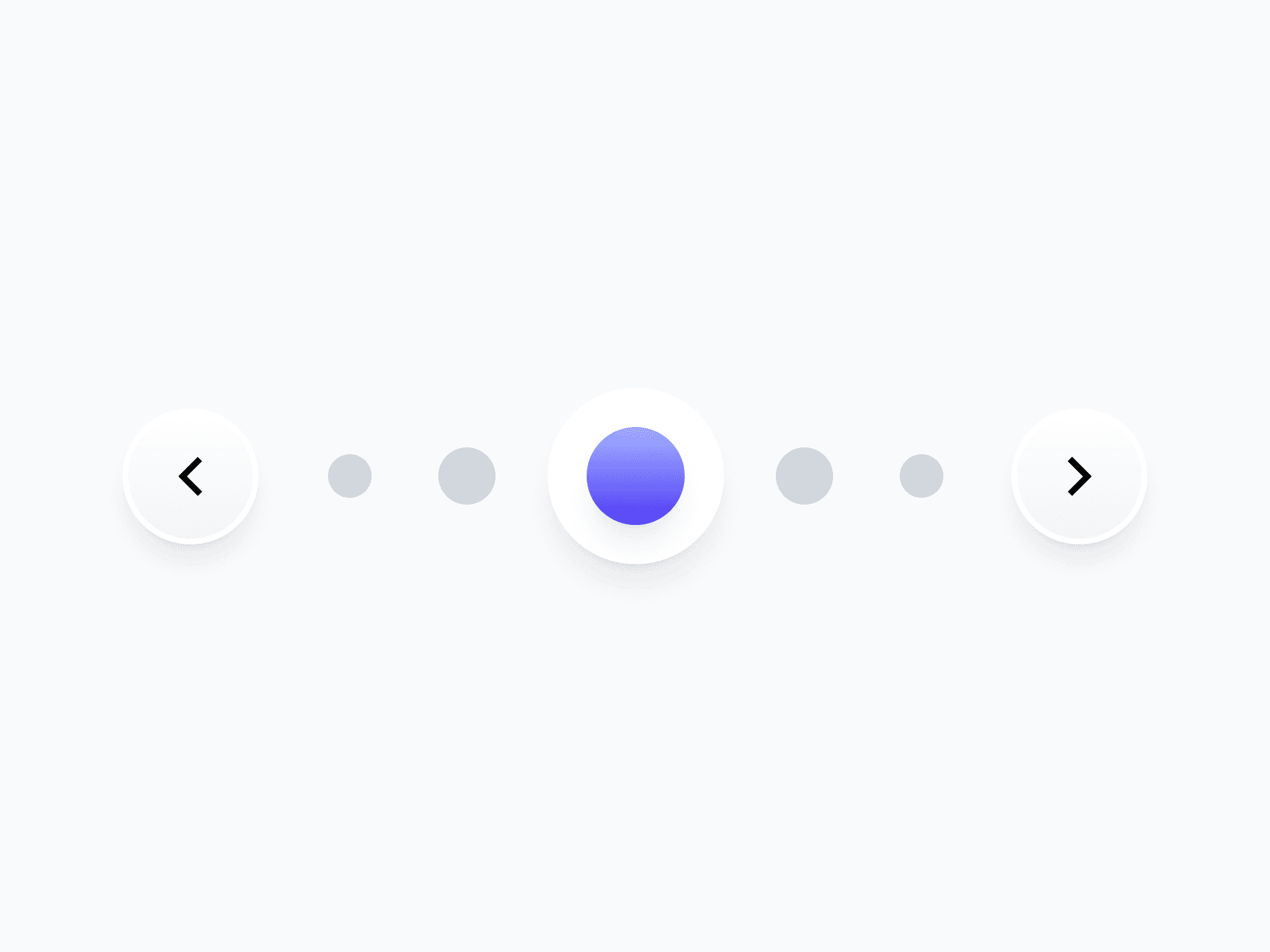
Navigation
Pagination
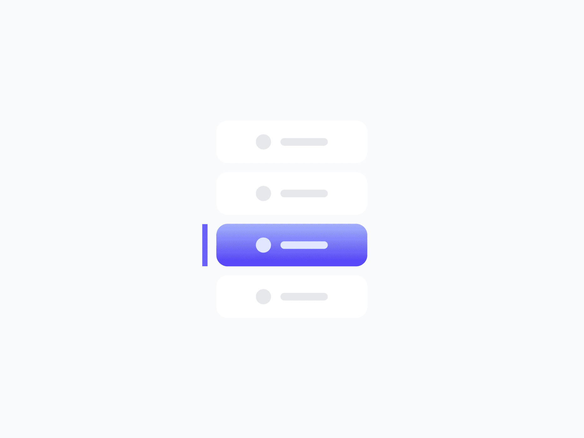
Navigation
Tab Menu
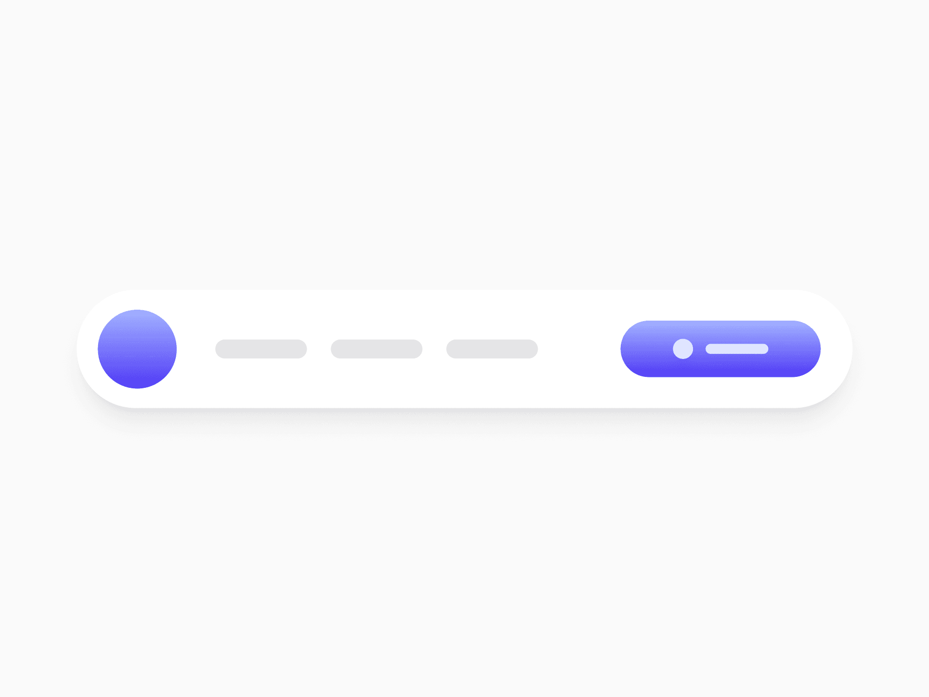
Navigation
Header Navigation
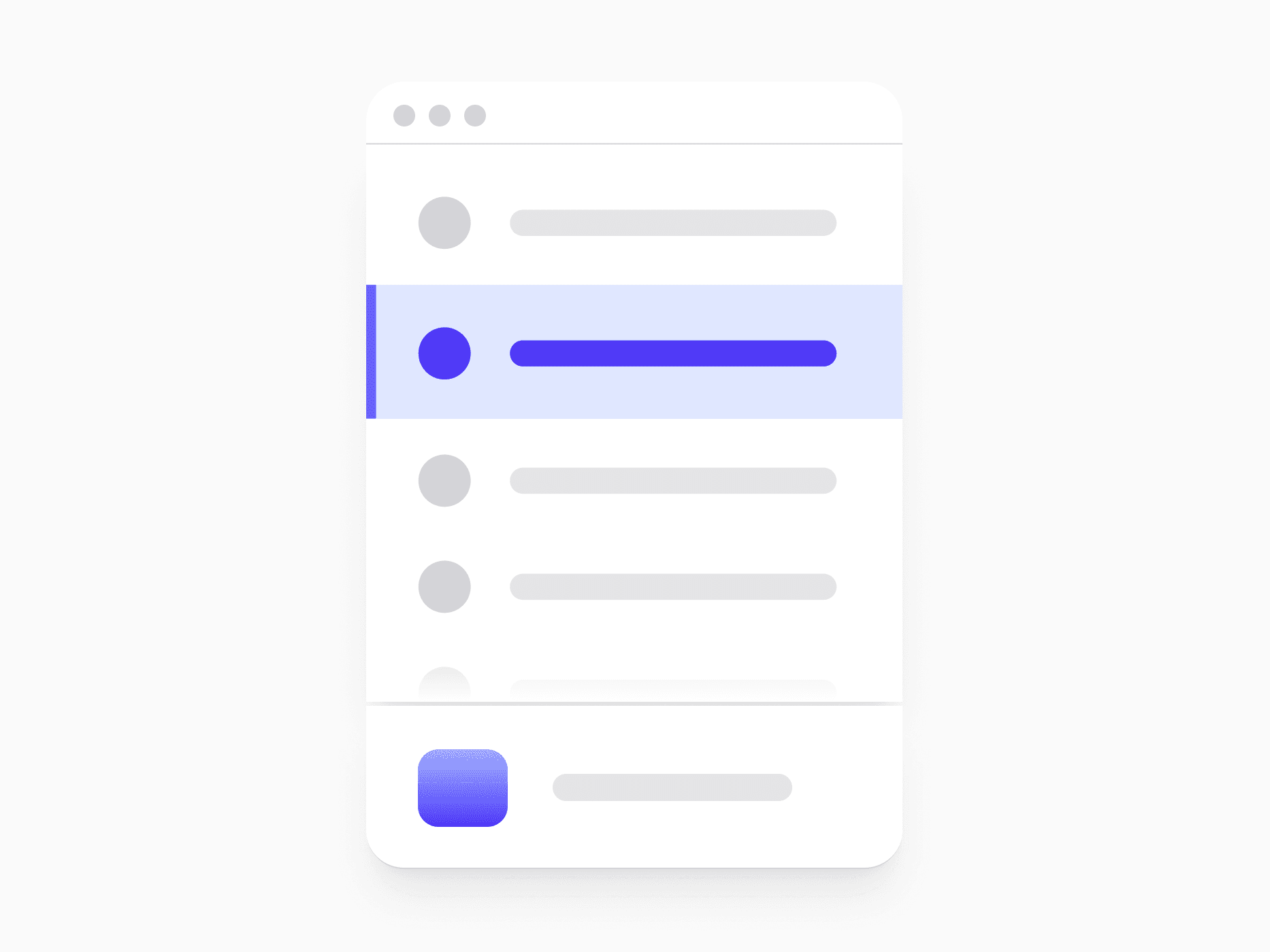
Navigation
Sidebar Navigation
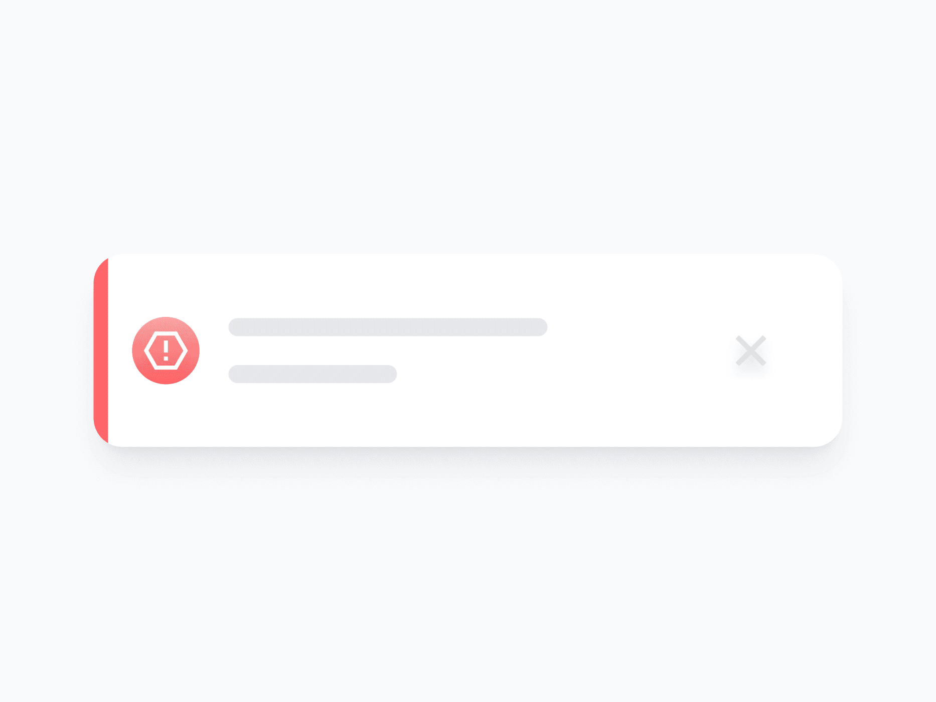
Feedback
Inline Alert
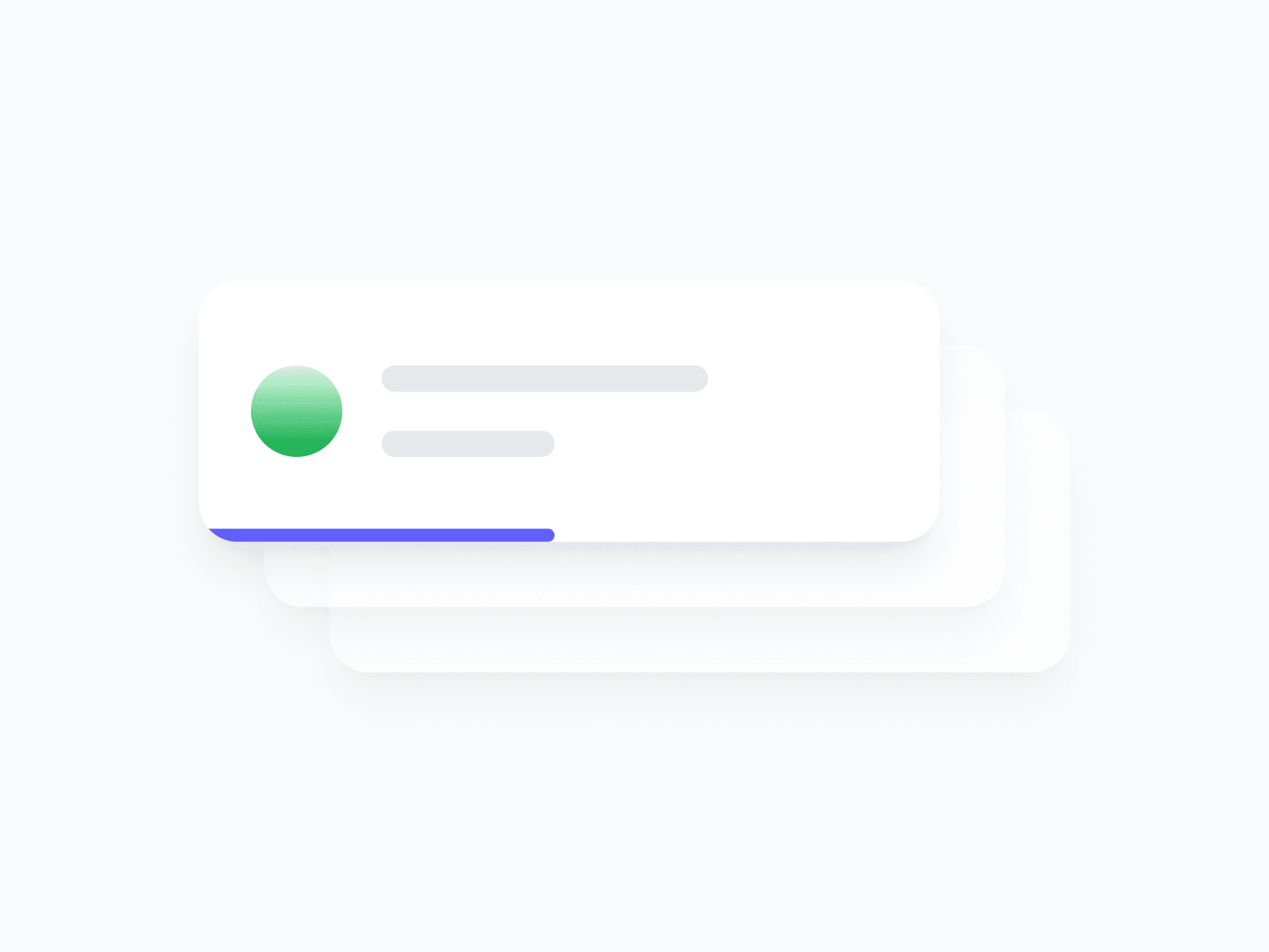
Feedback
Toast / Snackbar
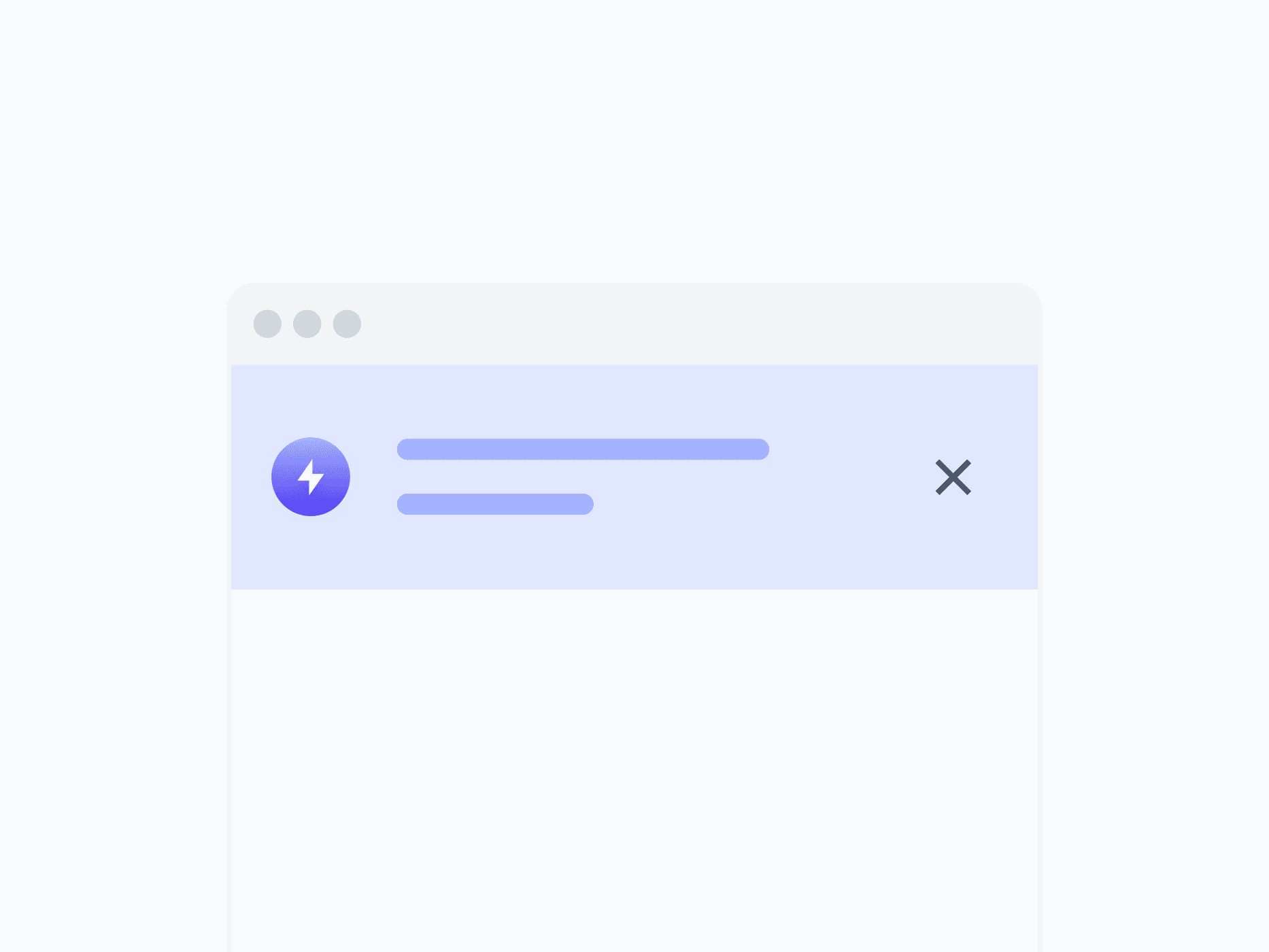
Feedback
Alert Banner
Overlay Items
Tooltip
![Popover [Rich Content]](/_next/image?url=%2Fwebsite%2Fcomponents-popover.png&w=3840&q=75)
Overlay Items
Popover [Rich Content]
Overlay Items
Modal / Dialog
Overlay Items
Dropdown Menu

Overlay Items
Info Tooltip
Overlay Items
Command Menu

Overlay Items
Rating
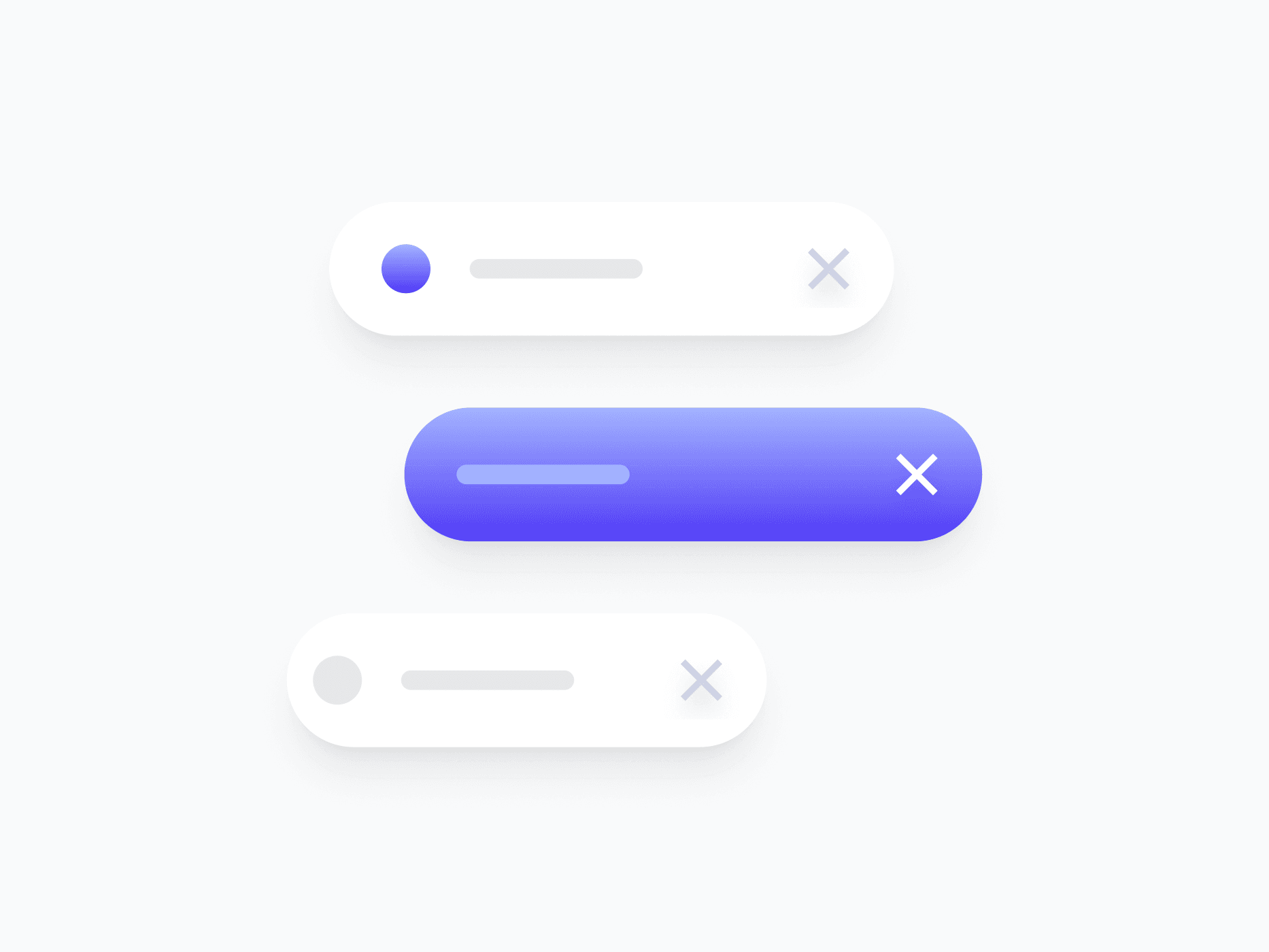
Indicators
Chips
![Badge [Tag]](/_next/image?url=%2Fwebsite%2Fcomponents-badge.png&w=3840&q=75)
Indicators
Badge [Tag]
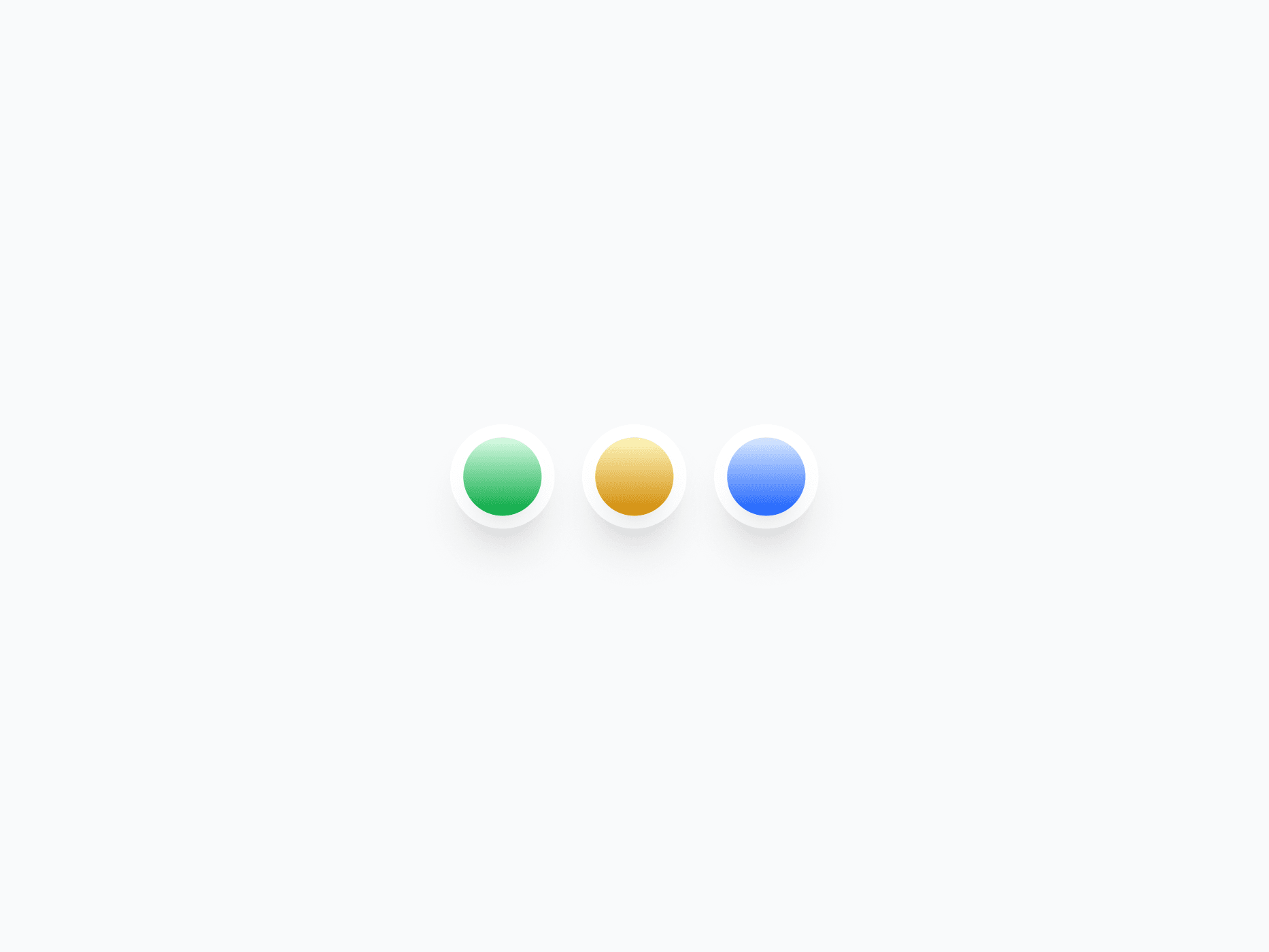
Indicators
Status Badge
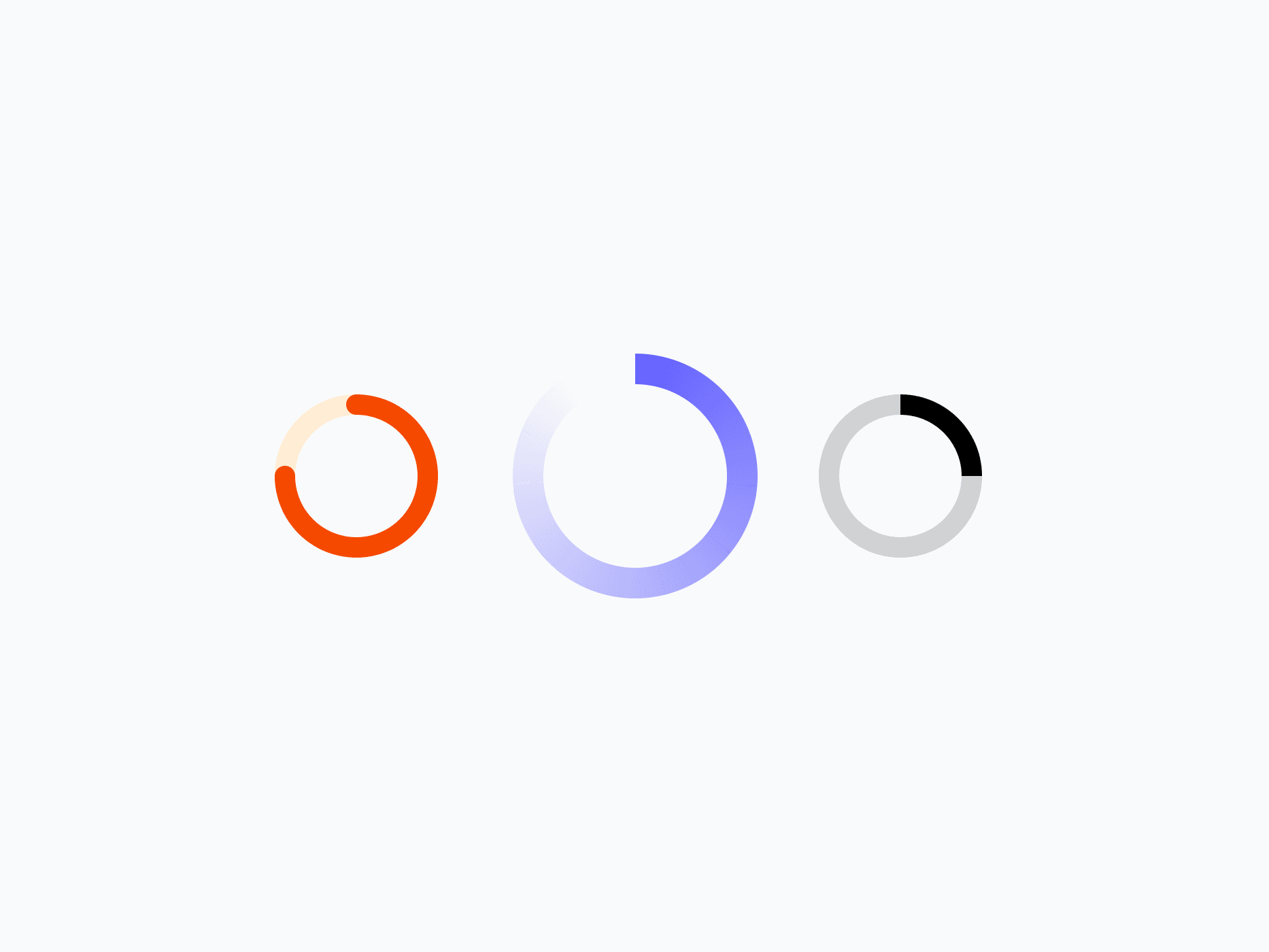
Indicators
Spinner - Loaders
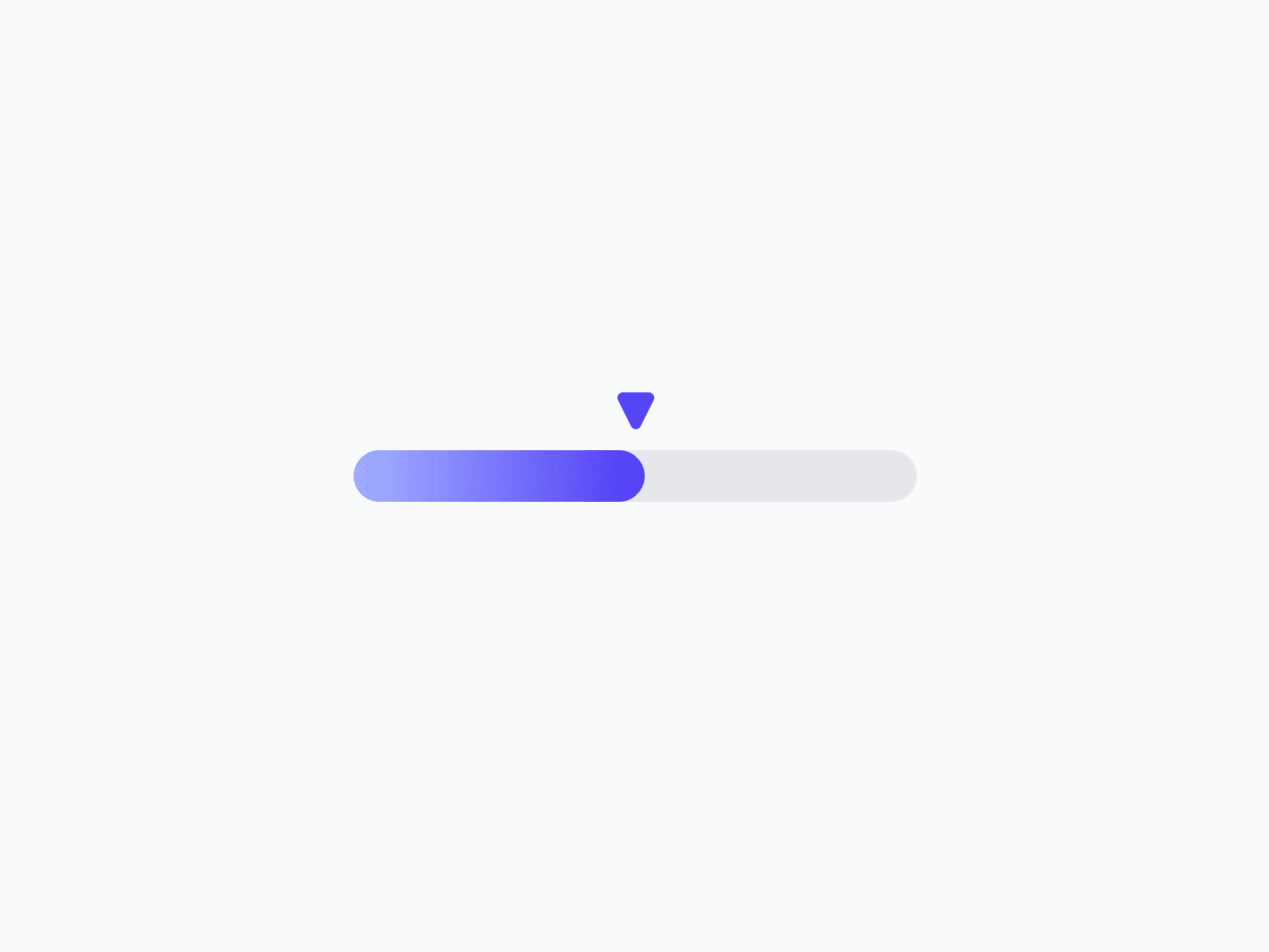
Indicators
Progress Indicators
Indicators
Step Indicator

Data Display
Avatar

Data Display
Avatar Group
Data Display
Content Divider (Separator)
Data Display
Tree View
Media & Rich Content
Accordion
Media & Rich Content
Blog Contents
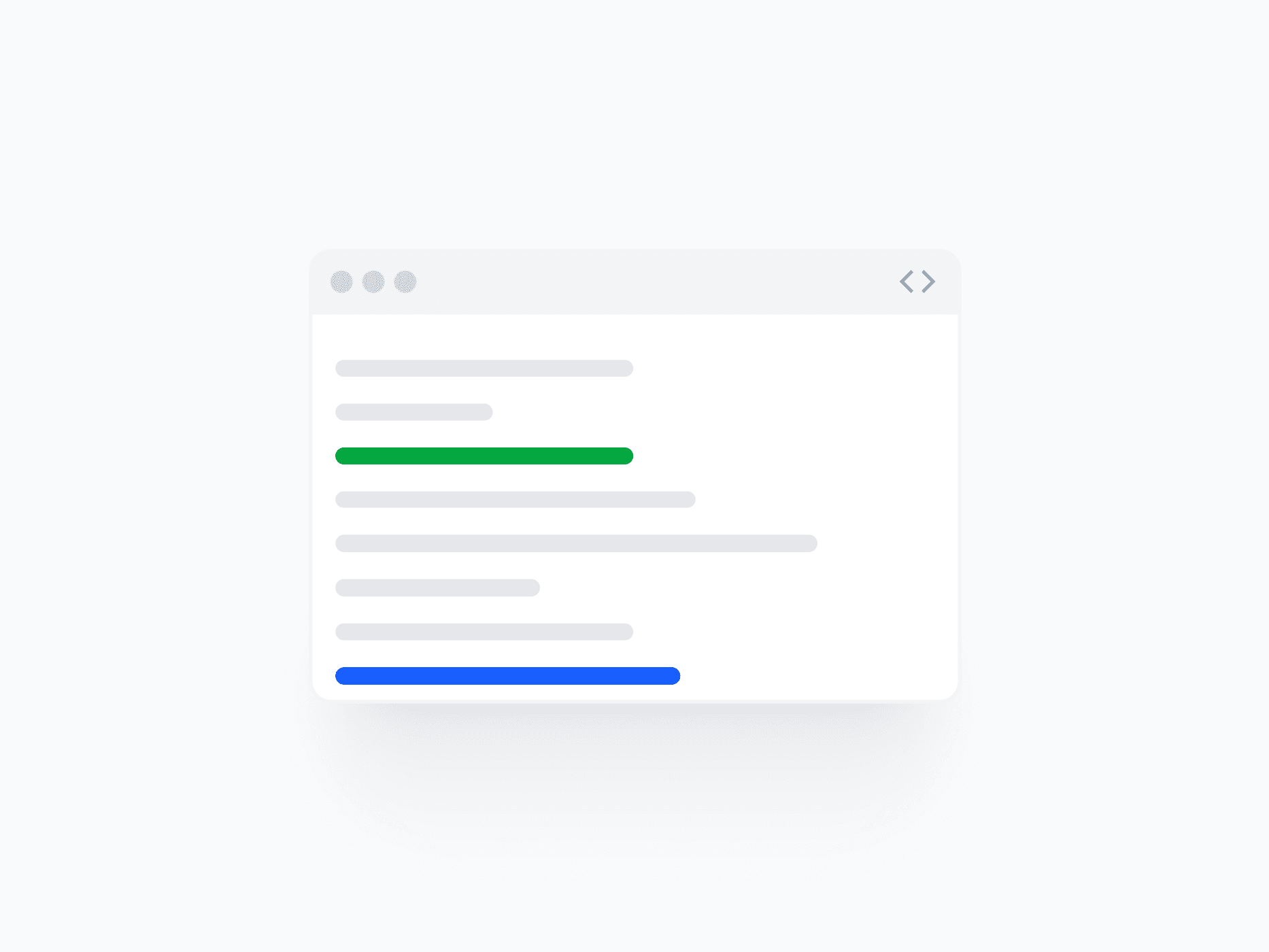
Media & Rich Content
Code Block
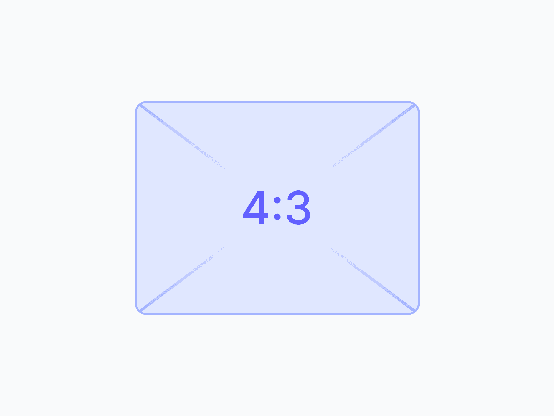
Utility
Aspect Ratio
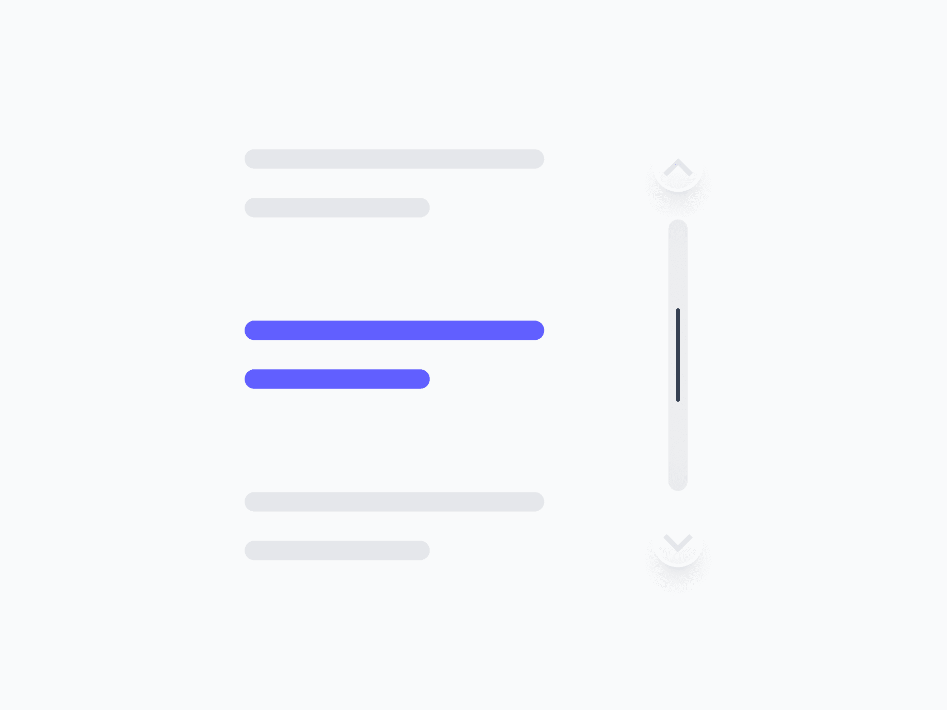
Utility
Scroll Bar
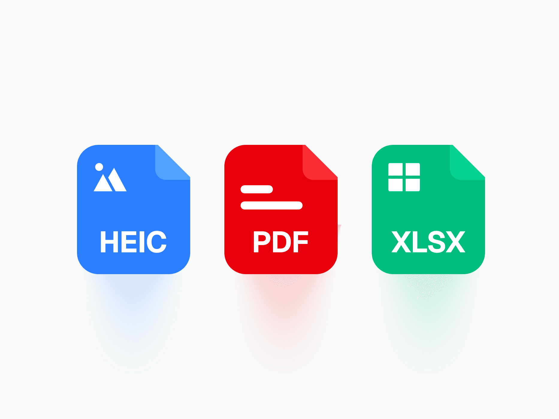
Assets
File Format
Questions,
answered clearly.
Plans, pricing, licensing, updates, and technical questions, all answered in one place.
Still have questions?


Your current plan is a one-time payment, no subscriptions, no recurring charges for what you buy today. Some future Create UI products (such as AI-powered features) may be offered as optional add-on subscriptions, but these are entirely separate and will never affect your existing purchase. What you buy now, you own permanently.

Stop deciding. Start shipping.
Install it today and your next screen takes an hour instead of a day. Keep rebuilding from scratch, and next quarter looks exactly like this one.
Start Free Now. Upgrade whenever you need.
